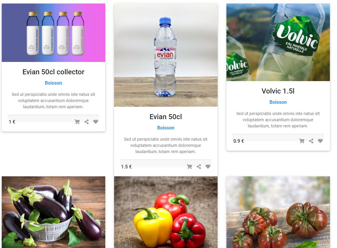
Topic: Card images in row
jeromerider
free
asked 4 years ago
Hi,
I want my card images - which are different in size / proportions - displaying with the same height. Width is ok.
After looping through datas in back-end with MDBCard, I already achieved to get my datas displaying on 3 columns thanks to <MDBCol md='4'>.
<MDBCardImage cascade className='img-fluid... doesn't seem to have any effect on it.
I tried many className settings through <MDBCardImage> tag and it led to no change.
Here is a screen what is displayed with my code, and the code :

`
            <MDBRow>
                {
                    this.state.produits.map(
                        produits =>
                            <MDBCol md='4'>
                                <MDBCard wide>
                                    <MDBCardImage
                                        cascade
                                        className='img-fluid'
                                        overlay="white-light"
                                        hover
                                        src={produits.photoPath}
                                        alt={produits.name}
                                    />
                                    <MDBCardBody cascade className='text-center'>
                                        <MDBCardTitle className='card-title'>
                                            <strong>{produits.name}</strong>
                                        </MDBCardTitle>
                                        <p className='font-weight-bold blue-text'>{produits.type}</p>
                                        <MDBCardText>
                                            Sed ut perspiciatis unde omnis iste natus sit voluptatem
                        accusantium doloremque laudantium, totam rem aperiam.{' '}
                                        </MDBCardText>
                                        <MDBCardFooter className='px-1'>
                                            <span className='float-left font-weight-bold'>
                                                <strong>{produits.price} €</strong>
                                            </span>
                                            <span className='float-right'>
                                                <MDBTooltip domElement placement='top'>
                                                    <i className='grey-text fa fa-shopping-cart mr-3' />
                                                    <span>Add to Cart</span>
                                                </MDBTooltip>
                                                <MDBTooltip domElement placement='top'>
                                                    <i className='grey-text fa fa-share-alt mr-3' />
                                                    <span>Share</span>
                                                </MDBTooltip>
                                                <MDBTooltip domElement placement='top'>
                                                    <i className='grey-text fa fa-heart' />
                                                    <span>Add to Whishlist</span>
                                                </MDBTooltip>
                                            </span>
                                        </MDBCardFooter>
                                    </MDBCardBody>
                                </MDBCard>
                            </MDBCol>
                    )
                }
            </MDBRow>
        </MDBContainer>
`
Wojciech Staniszewski
staff
answered 4 years ago
Hi!
Your photos are not properly scaled to fit that way. The img-fluid class won't fix the issue because it will fit the photos to the width, not the length. You should try to rescale Your photos or add custom styling. My proposition is to remove img-fluid and add custom css class:
.card-header-image {
  height: 18vh;
  width: 100%;
  object-fit: cover;
}
Best regards.
FREE CONSULTATION
Hire our experts to build a dedicated project. We'll analyze your business requirements, for free.
Answered
- ForumUser: Free
- Premium support: No
- Technology: MDB React
- MDB Version: 5.0.1
- Device: ROG Strix Scar 3
- Browser: Google Chrome
- OS: Windows 10
- Provided sample code: Yes
- Provided link: No
Piotr Glejzer staff commented 4 years ago
did you try yo use img-fluid class?
jeromerider free commented 4 years ago
Yes I already use img-fluid as you can see in my post. Are there other classes ? I tried responsive stuff too, didn't work either.
Piotr Glejzer staff commented 4 years ago
I would need to use your images to reproduce this problem on my site.
jeromerider free commented 4 years ago
Ok, here the first row images direct links :
PS : If you can't access (one of) them, use a french IP but I think they're worldwide