Topic: Any use of href to a real page causes the screen to clear and be re-rendered
David J
free
asked 5 years ago
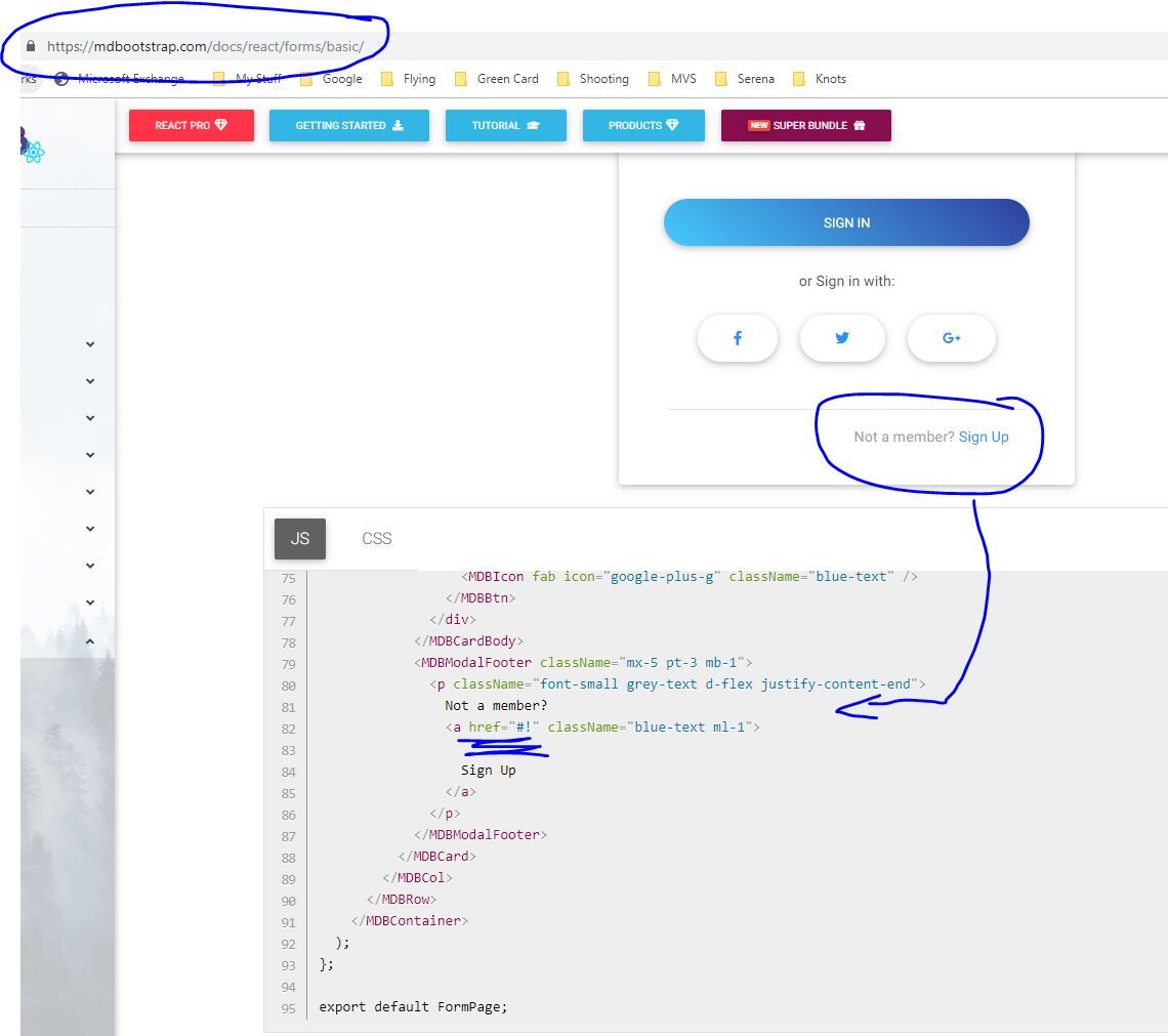
Any real use of href causes the screen to clear and be re-rendered All your examples use href=#! - which is a fake pointer that does nothing
Replace the #! with /login for example to a real page causes the screen to be cleared and re-rendered. See your demo screen below

David J
free
answered 5 years ago
Yes it was added to the css as you suggested
 .margin-none {
  margin:0 !important
}

Konrad Stępień staff commented 5 years ago
Hi,
You could send me the screenshot or write what styles have Terms and condition? Maybe this element has a margin or something else, for example, padding.
Best regards, Konrad.
David J
free
answered 5 years ago
Konrad,
I made your suggested changes and it fixed the left margin but the Terms and Conditions have only moved left by a small amount

A lot of these 'bugs' would not occur if you were to use your MDB instead of using input and href in your samples.
<div className="font-small grey-text d-flex align-items-center">
                  <MDBInput label="Accept the" type="checkbox" id="checkbox1"
                    onChange={this.handleCheckbox} labelClass="margin-none" containerClass="pl-0"
                  />
                  <TermsModal></TermsModal>
                </div>
Konrad Stępień staff commented 5 years ago
Hi @David J,
Did you add styles for your css file? We will fix this bug with margins right of MDBInput.
And You're right, I talked to the team and your suggestions will be implemented. It is very possible that the examples presented do not have the appropriate components because when creating the documentation they may not have been existing yet. I'm not sure about this.
Please expect an update, we will try to fix it as soon as possible.
Kind regards, Konrad.
Konrad Stępień
staff
answered 5 years ago
Hi @David J,
This margin seems like a bug. You can fix it with labelClass property. Just add your own class, for example
labelClass="marign-none" and in your css file add this class.
.margin-none {
    margin:0 !important
}
we will try to fix this bug near future.
But if you want to remove space in checkbox you can use containerClass="pl-0" in your MDBInput.
This is my code.
<MDBInput
  label='Accept the'
  type='checkbox'
  id='checkbox1'
  onChange={handleCheckbox}
  labelClass="margin-none"
  containerClass="pl-0"
/>
If there is anything else I could do for you do not hesitate to ask me. I'll be happy to help you.
Best Regards, Konrad.
David J
free
answered 5 years ago
So in the 2 examples above, how do I move the checkbox to the left so it is aligned vertically and how to I remove the space between 'Accept' and 'Terms'?
Konrad Stępień
staff
answered 5 years ago
Hi @David J,
Thank you for your suggestion. When it comes to using MDInput, We will look at examples and I need to discuss it with the team. But MDBNav is specific component who needs Router, and therefore we don't pass this component to many examples. However, I will discuss it also with my team.
Again, thank you for suggestion and we appreciate this.
Best regards, Konrad.
David J
free
answered 5 years ago
and here is another example from changing to MDBInput form <input for checkbox where the box will not line up.

and the simple code
<div className="font-small grey-text d-flex align-items-center">
                  <MDBInput label="Accept the" type="checkbox" id="checkbox1"
                    onChange={this.handleCheckbox}
                  />
                  <MDBNavLink to="/login" onClick={this.toggle}>
                    <MDBNavItem>Terms</MDBNavItem>
                  </MDBNavLink>
                </div>
                <div className="font-small grey-text d-flex align-items-center">
                  Already a member?
                  <MDBNavLink to="/login" >
                    <MDBNavItem>Sign in</MDBNavItem >
                  </MDBNavLink>
                </div>
David J
free
answered 5 years ago
I understand that these are only examples but you could encourage customers to fully use MDB by making sure that your examples use MDB throughout instead of using references to href=# which causes problems and hides defects as I have already reported against the Admin Dashboard Pro.You also have a lot of examples that use <input instead of using MDBInput which would be far more useful to customers when reviewing the examples.
Here is an example where I have tried to change one of your samples that is using <input
and href to use MDBInput and MDBNavItem
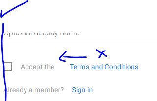
however the 2 fields are too far apart

The code is quite simple and note that I had to use align-items-center to get the fields to be horizontally level as you indicated in the other problem ticket but the gap between the fields is too great. This is not a problem when using <input and href . So all your examples appear to work. What is needed to fix this?
<div className="font-small grey-text d-flex align-items-center">
                  <MDBInput label="Accept the" type="checkbox" id="checkbox1"
                    onChange={this.handleCheckbox}
                  />
                  <MDBNavLink to="/login" onClick={this.toggle}>
                    <MDBNavItem>Terms and Conditions</MDBNavItem>
                  </MDBNavLink>
                </div>
Konrad Stępień
staff
answered 5 years ago
Hi @David J,
It is only product example, how to use the component.
If you need dynamic redirection then we encourage you to use MDBNav in your project. The examples should be simple to understand and that's why we try not to add too many elements that would be excessive to present the example.
If you wish I can make you this example with MDBNav.
Best regards, Konrad.
FREE CONSULTATION
Hire our experts to build a dedicated project. We'll analyze your business requirements, for free.
Opened
- ForumUser: Free
- Premium support: No
- Technology: MDB React
- MDB Version: 4.18.0
- Device: Desktop
- Browser: Chrome
- OS: Windows 10
- Provided sample code: No
- Provided link: No