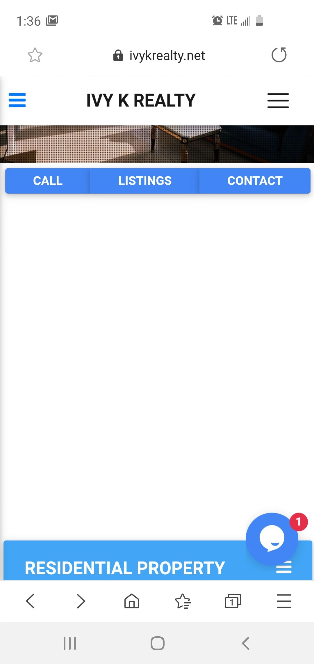
Topic: Strange space between components on mobile browser
Mackenzie
priority
asked 5 years ago
Expected behavior All my components vertically align with no huge spaces or gaps in content Actual behavior it works fine on computer but when i test the site on a mobile browser there is a large vertical space between the CTA Bar (button group below opening carousel below "contact") and the next element which is an accordion. Resources (screenshots, code snippets etc.)
PC:
Mobile: 
Marta Wierzbicka
free
answered 5 years ago
Hi,
I've checked your page on web developer tools and on iPhone 6s and I don't see the problem you've mentioned above, look at my screenshot below.
 If you still need help, please provide more details, like a version of the system of your phone and other details that could help reproduce the problem.
Best, Marta
FREE CONSULTATION
Hire our experts to build a dedicated project. We'll analyze your business requirements, for free.
Answered
- ForumUser: Priority
- Premium support: Yes
- Technology: MDB jQuery
- MDB Version: 4.16.0
- Device: mobile
- Browser: chrome / samsung
- OS: android
- Provided sample code: No
- Provided link: No