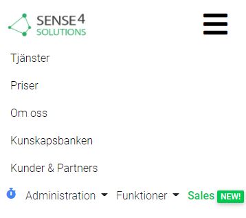
Topic: Navbar - right section will not line-break per row as left section in mobile mode
Sense4
priority
asked 4 years ago
*Expected behavior*I expect each navbar item to be in a separate row while being in mobile mode. When being on mobile the navbar gets compact in a "hamburger" menu.
*Actual behavior*If there is a left and a right section of the navbar the only part of the navbar items to "line break" is the left section. The right section stays in one row no matter how much text and how many navbar items I use. I see the same results in the navbar demos on this site as well as the navbar in my own code.
*Resources (screenshots, code snippets etc.)*Code I would refer to this site. Screenshots below.
Normal webbrowser mode:

Mobile version 1

Mobile version 2

Krzysztof Wilk
staff
answered 4 years ago
Hi!
Remove .nav-flex-icons class from the second ul element. This class groups items in a single row.
I forked your snippet and made corrections. Check it here: https://mdbootstrap.com/snippets/jquery/krzysztof-wilk/2756361
Hope it'll meet your expectations :)
Best regards
FREE CONSULTATION
Hire our experts to build a dedicated project. We'll analyze your business requirements, for free.
Resolved
- ForumUser: Priority
- Premium support: Yes
- Technology: MDB jQuery
- MDB Version: 4.14.1
- Device: PC Asus
- Browser: Chrome
- OS: Windows
- Provided sample code: No
- Provided link: No
Krzysztof Wilk staff commented 4 years ago
Hi!
Could you make a snippet with your code using our online editor? You can find it here: https://mdbootstrap.com/snippets/. It'll be very helpful :)
Best regards
Sense4 priority commented 4 years ago
https://mdbootstrap.com/snippets/jquery/sense4/2754683
It is the right part of the menu that is the problem not the left. And only in mobile mode. I want to get them line-breaked for each item.
Sense4 priority commented 4 years ago
Thank you @Krzysztof Wilk, I had been trying to add mr-auto (margin right auto) to the second ul before but didnt get it the correct way. Now I see that I should have added ml-auto (margin left auto). My brain was simply not with me. Thank you for the support and tell the team what a great job you do - MDBS is simply awesome!
Krzysztof Wilk staff commented 4 years ago
Hi!
Thanks for these warm words! I'm glad I could help. If you have more questions - feel free to ask :)
Best regards