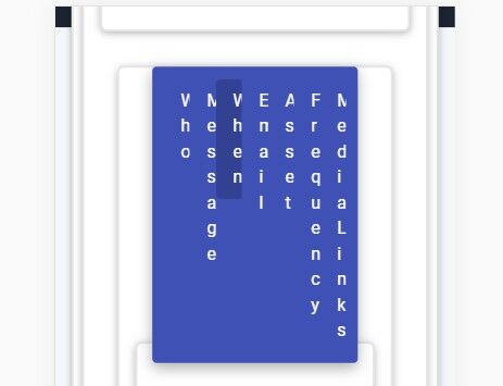
Topic: Is there a better mobile navbar solution?
drclohite
pro
asked 5 years ago
Expected behavior I would like it to look nice. How can I make it look better? Can I detect for mobile and then have different code? if so what? Or is there an alternative to the tab bar system I am using?
Actual behavior cramped and maybe unreadable if you did not know what to expect. PC is fine. Mobile is the issue
Resources (screenshots, code snippets etc.)


drclohite
pro
answered 5 years ago
I worked it out, thank you. The code changes are all in one line as follows:
<ul class="nav nav-tabs flex-column flex-sm-row justify-content-around nav-fill md-tabs indigo" id="topTabJust" role="tablist">
Thank you
drclohite
pro
answered 5 years ago
Yes brilliant, not sure what you did, I will need to work that out, yes, this is looking much better now. Thank you. I will see if I can replicate it. Is it possible for you to let me know what you did :;
drclohite
pro
answered 5 years ago
Yes brilliant, not sure what you did, I will need to work that out, yes, this is looking much better now. Thank you. I will see if I can replicate it. Is it possible for you to let me know what you did :;
Marta Wierzbicka
free
answered 5 years ago
Hi,
please, check out your snippet: https://mdbootstrap.com/snippets/jquery/drclohite/1807416 now. It is correct solution for you?
Best, Marta
Marta Wierzbicka
free
answered 5 years ago
Hi,
would you create a snippet showing the problem here: https://mdbootstrap.com/snippets/? I'll try to help you in your real code.
Best, Marta
FREE CONSULTATION
Hire our experts to build a dedicated project. We'll analyze your business requirements, for free.
Answered
- ForumUser: Pro
- Premium support: No
- Technology: MDB jQuery
- MDB Version: 4.13.0
- Device: PC
- Browser: Chrome
- OS: Windows 10
- Provided sample code: No
- Provided link: No