Topic: How To: How To Make Cards Without Margin On Bottom/Top?
ewgiddings
free
asked 5 years ago
Is there any way / does anyone know any way to have MDB cards (using Angular) have no margin on the bottom? By this I mean I have a bunch of product and member cards in a list. Some cards are long, some cards are short. This causes empty space before the next row.
See the cards on this site for an example: https://www.tragoa.com
I am wanting the cards in these lists to fill the empty space caused by the variations in length of cards.
Does anyone know how?
See how the images on this site hug up on each other? Margin based on size of the picture above/below? This is how I am looking for the cards to be:
Thank you to anyone who can help, Eric
ewgiddings
free
answered 5 years ago

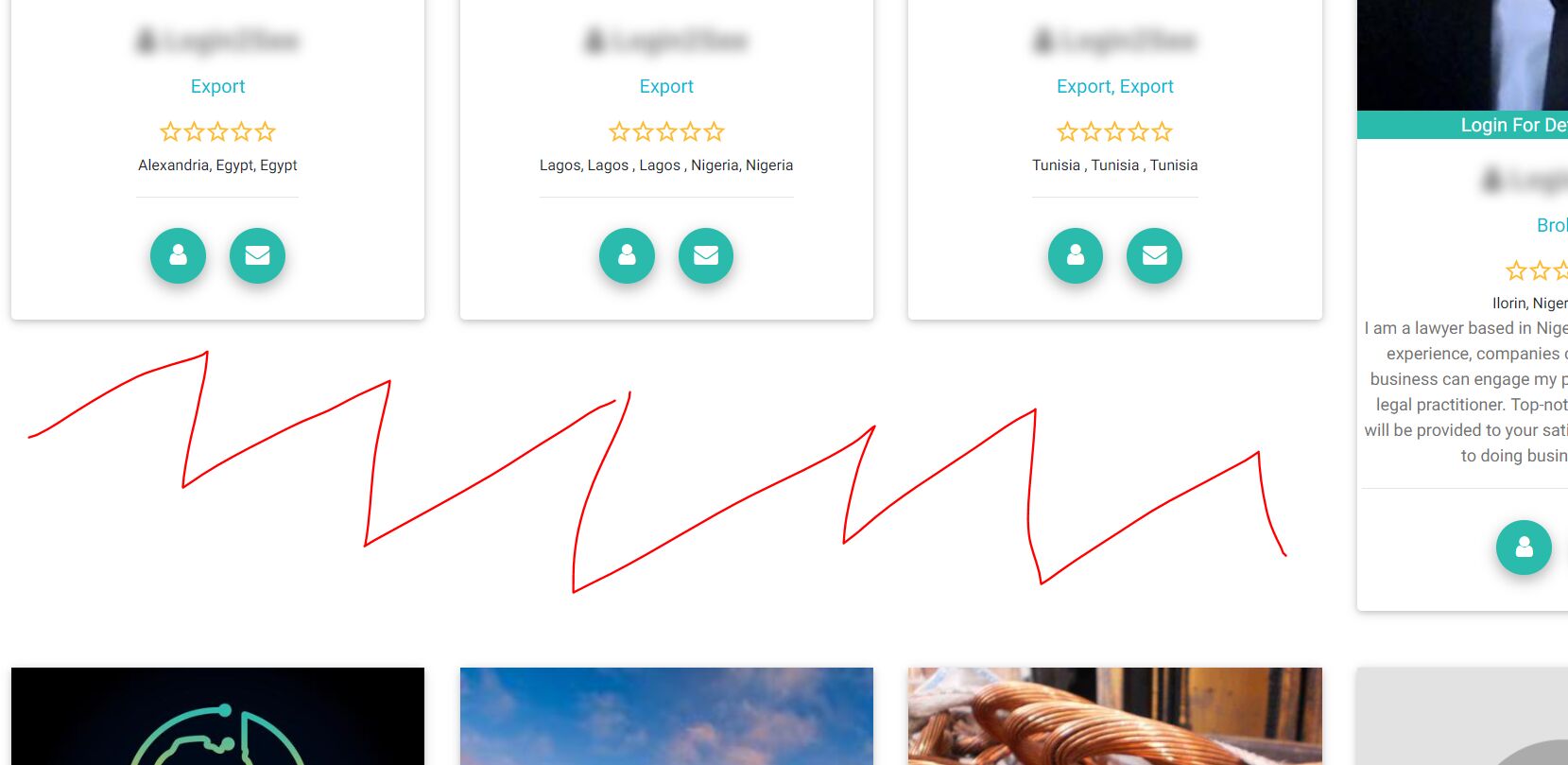
So for example, see the red line area? I want this to be removed for the 3 cards below it. The card on the far top right is pushing every other card down, and leaving this empty area.
I am curious, how do I get it so each card below anothe rcard fills this empty space that I have marked in red? Do you know?
The site it is on is https://www.tragoa.com if the Inspector Dev Tools helps?
Thank you for any insight, Eric
Arkadiusz Idzikowski staff commented 5 years ago
Could you provide an example html you use in this case to render the row of the cards?
Single card component doesn't have any margin on bottom, so you need to remove the margin from the row container. The solution to this problem will depend on how your html structure looks.
FREE CONSULTATION
Hire our experts to build a dedicated project. We'll analyze your business requirements, for free.
Answered
- ForumUser: Free
- Premium support: No
- Technology: MDB Angular
- MDB Version: 7.5.4
- Device: Surface
- Browser: Chrome
- OS: Windows
- Provided sample code: No
- Provided link: Yes
Arkadiusz Idzikowski staff commented 5 years ago
Do you need to remove margin/padding of card component or of the row that contains the cards?
ewgiddings free commented 5 years ago
I am not sure. Removing the margin of the row I don't think will have the cards below it hug up against it. Were you able to tell from using Chrome Inspector on the site that I provided?
I am unsure how to do this, but want to.
I do not know how to make it happen, but want how the cards are displayed on the first link, to look like the images on the second link. Meaning I want a card below another card to hug up onto the card above it regardless of the height of any other card.
Does this make sense what I am asking?
Thank you, Eric