Card 1 title
This is a wider card with supporting text below as a natural lead-in to additional content. This content is a little bit longer.
Example card hover-shadow + no border
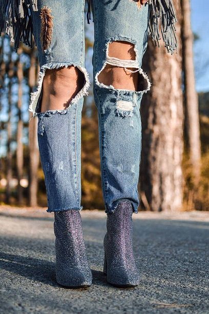
These boots were made for walking...
and that's just what they'll do...
Ex card with hover-shadow + border
Shadow + hover shadow
as a border but still not as plain as none?! Also, the text can hover... #inception: hover+ hover+ hover w margin padding
Ex card with default style + hover
NOTE: In order to work you must explicitly
set the columns to rounded-3, as the card-title to rounded-3. My personal fav minus the inception part lol
Not as fancy
as a border but still not as plain as none as the card "hover" and "hover-shadow" are both applied
Ex card with shadow hover-shadow + no-border
Default
default card style has a subtle dropshadow but no effects
Ex card with no border style/effect supplied